I’m the Office 365 guy. I don’t twist all the knobs, turn the dials and pull the levers. But I’m the in-house strategist and evangelist. I love this stuff.
Some of the technology is truly game-changing in the productivity sense.
For example, we’ve launched Microsoft Teams for faculty and staff. We’re on the cusp of lighting it up for students. Teams is new to the organization. We haven’t used technology like this in this capacity before.
Sure, we’ve had Skype and SharePoint and all that for years. But with Teams, we’ve rolled out corporate-wide instant messaging and web conferencing with a low barrier to entry.
We’ve rolled out web-based collaboration as the default experience for everyone. We’ve made email, not obsolete, but a second-choice for working together.
Mull on that for a moment. That’s huge.
With new tools, comes the relative chaos of change.
The biggest feedback is the challenge of When-To-Use-What. I’ve been beating around the best way to help people figure this out ever since we decided to roll-out Office 365. Maybe even before. Because, aside from fixing broken things, that’s what the customer service side of IT is about: helping people get past the friction and leverage technology to do what ever Good Works they’re supposed to perform.
We talk about this as a management team all the time. At our last meeting of the minds, Jim said “We need an infographic.” I said, “Sure.”
And that’s what this post is about. Not the infographic itself, but how to make one.
You’ll have to wait until next week for When-To-Use-What. #baitandswitch
The web has a bevvy of applications that can help you make an infographic. And I looked at a bunch and got a feel for how they all work. Making an infographic requires planning, so start there. I don’t think whacking away at the tool will produce a suitable professional result. But hey, you do you.
All the tools work the same way. Pick a template to start with. Or don’t. You have a canvas with a drag-and-drop toolbar. The free versions of all these apps have a limited selection of widgets. Pay the fee and get more widgets. Pretty much like every app on the web nowadays.
insert record scratch sound-effect.
But what fun would that be? Office 365 has some powerful tools. And I gotta evangelize.
Let’s up-end the tool box and see what we got:
The Obvious Candidate: Microsoft Publisher
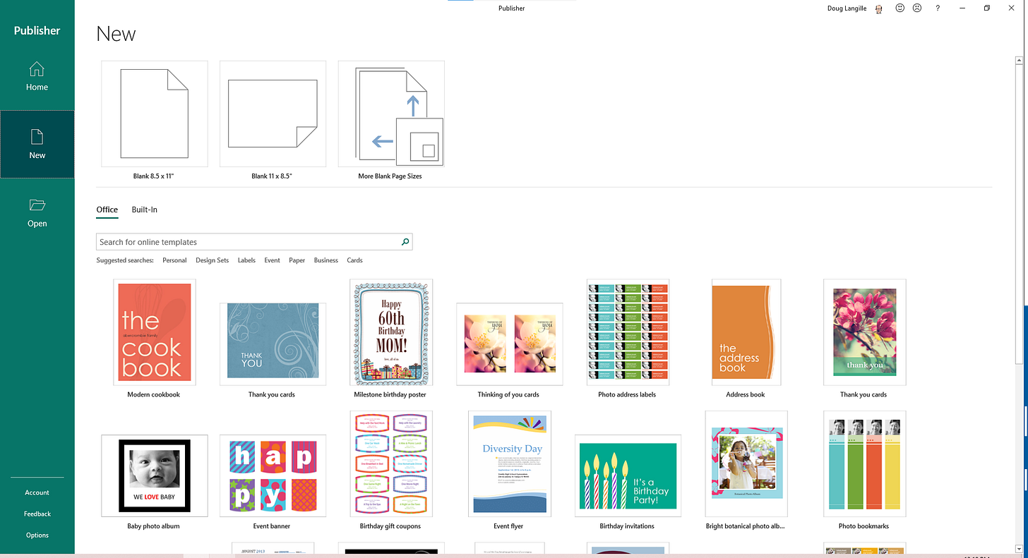
Publisher is a desktop publishing tool designed for print layouts. Text blocks, word art and some objects to move around. Surprisingly, it’s like a trip in a Delorean to 2005. I’m all for nostalgia, but this tool is really limited. It actually makes me long for software I used in the late 80s. PrintShop or something like that. Great for printing happy birthday banners on fan-fold paper. But not much else.
Every once in a while, I fire up Publisher to make something and am always, always, disappointed.
Oh, and it’s a Windows-only desktop application. I kinda want to uninstall it just to remove the temptation to try it again. It’s that bad.
Because Stencils: Microsoft Visio
The screenshot tells the tale. This is not an infographic tool. Now, I rarely use Visio for diagramming anymore. It’s too much tool for too little benefit. It’s really for networking architects and process engineers only.
I won’t uninstall it because I need it from time to time. Also it’s a Windows-only desktop application. There’s a web viewer in Office 365, so maybe I don’t even need this installed either.
The Next Most Obvious Candidate: Microsoft Word
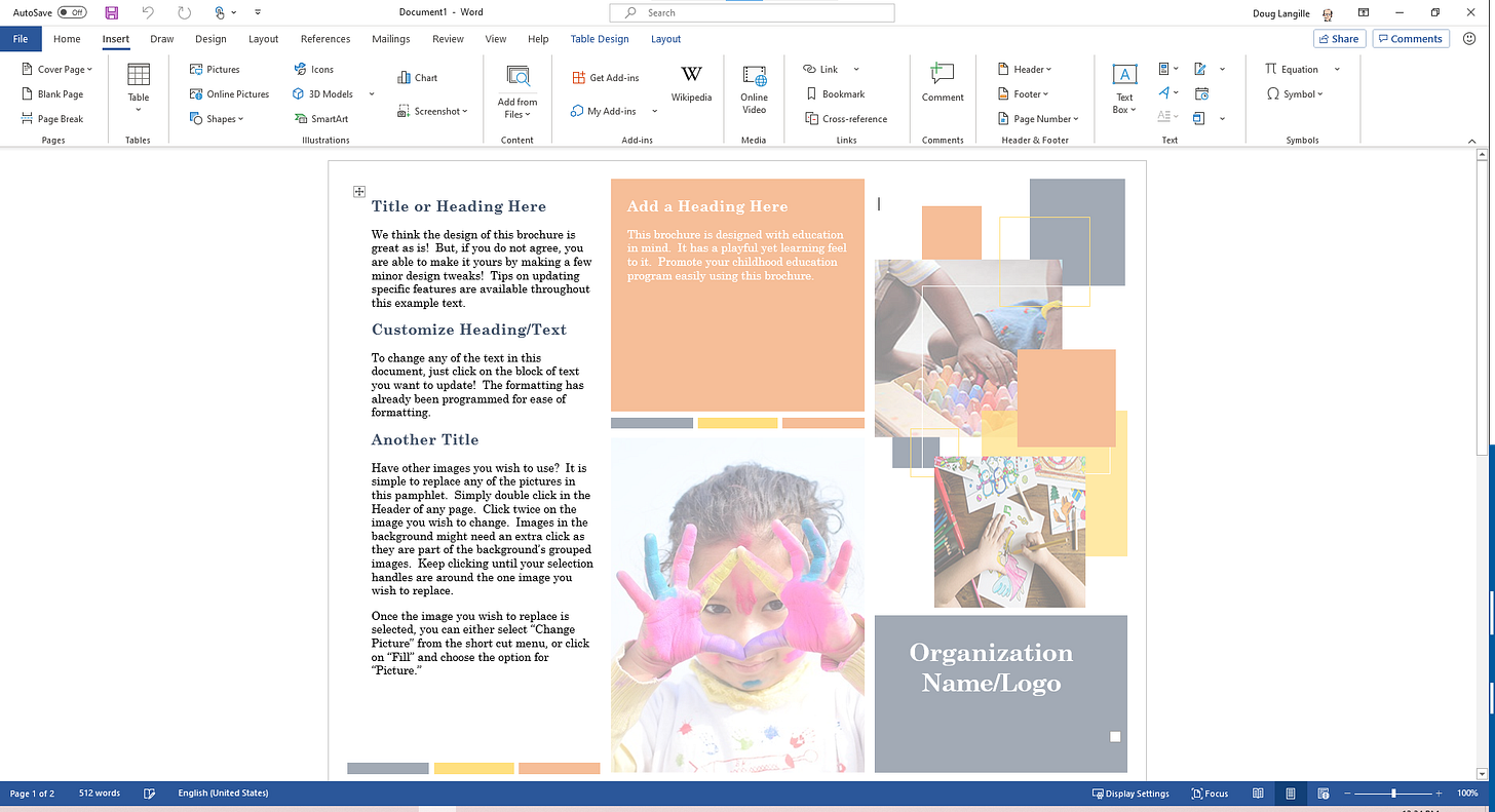
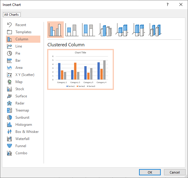
Okay, so Word is for documents– you know: words, paragraphs and stuff. But you can do some neat page layout things. By and large though, it’s about a stream of text, top to bottom. Inserting objects is easy enough. And there are a lot of object options: charts, smart diagraming, tables, images. The whole gamut.
To be honest, it’s a better desktop publishing software than Publisher in pretty much every category. And you can work on any device or browser you like.
By default, you insert in the stream of text, but you can fix position these things on a page. But it’s not an open canvas like the web apps. You have to do a lot of bendy things to make this work to make an infographic easily. Verdict: nope.
Because, Why Not: Microsoft Excel
Excel can be very visual and to my delight, it has pretty much all the objects as Word.
If I had a bucket load of numerical data to work with, then… maybe?
It’s a stretch.
Nah.
The Unexpected Contender: Microsoft PowerPoint
And here’s where things get weird.
Does it have an open canvas? YES!
Can I make it any size I want? YES!
Can it snap-to-grid and keep my stuff lined up? YES
Does it have lots of objects to work with? YES!
Can I create this on any computer or browser I’d like? YES!
Can I have animated GIFs in my infographic? YES!
Can I print an animated GIF? NO!
Huh. Who knew?
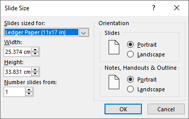
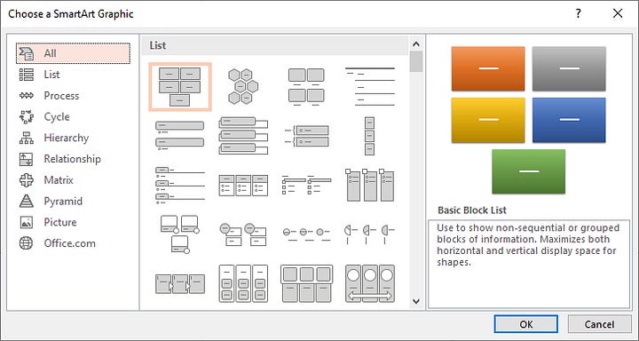
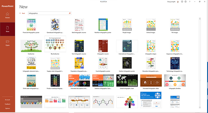
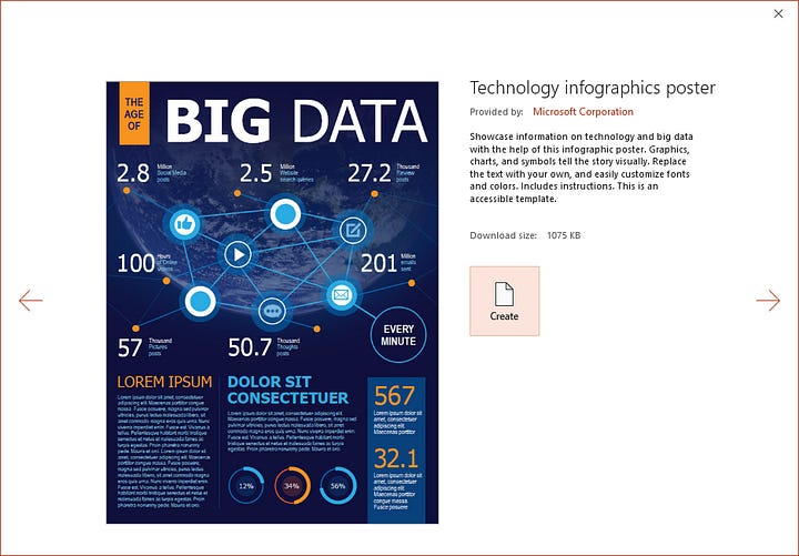
Apparently, Microsoft knew this needed to be a thing, because “infographics” is now a template type.
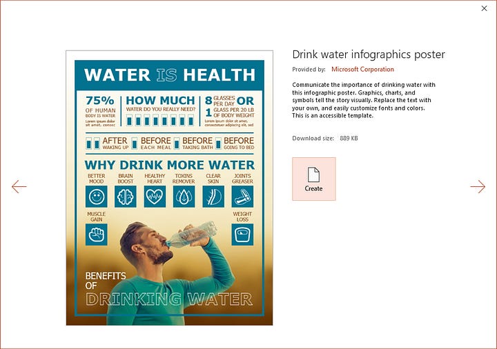
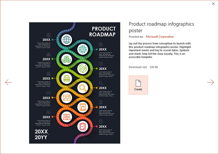
It’s funny how we can get sucked into tool bias.
You know: Maslow’s Golden Hammer where everything looks like a nail. But the reverse is true too. We can fall into tool blindness– where we assume only a single use case for a tool without considering other utility.
Anyway. BRB. I gotta finish my fancy-pants infographic now.


